Upfront I have to say I’ve been listening to Steve Jobs’ biography by Walter Isaacson, and might be a little bit of a Mac fan-boy (for a “windows” guy), and I’m a very happy iPhone and iPad user.
I hate crappy interface design. Ugly I can live with, but poor layout making things difficult to use really annoys me.
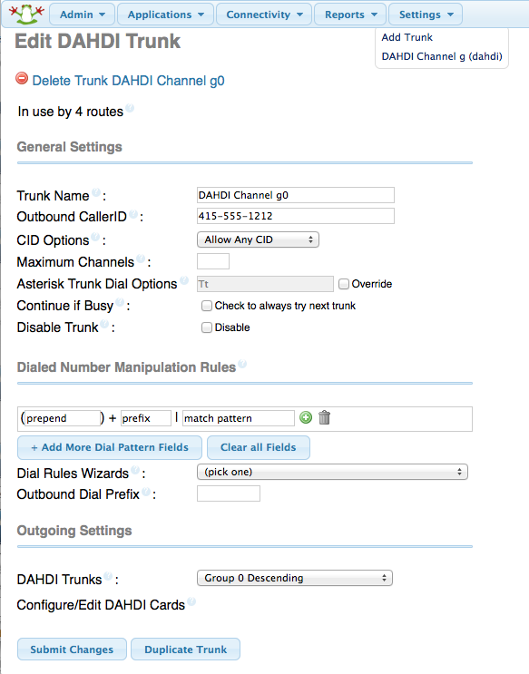
Yesterday I spent some time at LinC Yarra Valley setting up a server/PABX for them. It was sort of working, but I could not get outgoing calls to work through the PSTN. Nearly 5 hours later, combing through pages of modules with hundreds of options, then lots of config files, I finally found this option buried in the middle of the following page:
Disable Trunk!!
If you are going to have a setting to completely disable a feature:
a) why is it on by default?
b) why is it buried in the middle of the page, not right at the top?
c) why isn’t it highlighted just a little bit?
d) if it’s part of a configured system (which the page knows, because at the top of the page it says “in use by 4 routes”) why doesn’t it glow bright red and (heaven forbid) use the blink tag!
5 hours searching then Bam! Untick the box on two pages, and off it goes.
You learn something every day, I hope the freePBX team get it.
